Brand Identity
01colours - Primary
Respecting the brand's heritage the colour scheme has been
chosen to convey a strong and confident voice, embracing a forward-step and aligning it in the
modern cultural landscape. Our primary brand colors are red, white and black. They are used to
convey our brand values while providing accessibility, simplicity, and consistency throughout
all brand communications.
Use Pantone colours where possible.
Hope for Justice Red
PANTONE | 2035C /U
CMYK | 0 100 100 0
RGB | 214 0 28
HEX | D6001C
Hope for Justice Black
PANTONE | 419 C/U
CMYK | 76 65 66 90
RGB | 33 35 34
HEX | 212322
Plain White
PANTONE | N/A
CMYK | 0 0 0 0
RGB | 255 255 255 255
HEX | FFFFFF
Freedom Wall Grey
PANTONE | N/A
CMYK | 47 34 29 10
RGB | 142 158 148
HEX | 8E949E
1.3colours - tints
A tint is a percentage of a solid colour. Using tints
allows for a variation in tone, whilst using only one spot colour. It’s economical and
consistent while providing the designer with more scope when it comes to the supporting colour
palette.
Use them in increments of 10%.
02Typography
Our typography has been selected to convey powerful,
emotive messages while instiling a sense of authority.
FK Screamer Legacy is a key element in our brand. It works to maintain consistency, create
clarity, and provide a clear voice for the brand as a global leader in the fight against
slavery. It has been chosen based on its activist style in order to maximize its impact across
all applications while keeping it easy to read, ownable, and highly recognisable.
Canela Medium has been chosen for its authority in delivering editorial style messages to the
audience while providing a juxtaposition to the powerful bold characters of FK Screamer.
To complement both these typefaces and be agile across all platforms, Apercu was selected to be
used for smaller applications such as sub-headers and body copy.
Headlines, statements and key facts
FK SCREAMER LEGACY
Headlines and quotes - Secondary font
Canela Medium
Headlines and body copy
Apercu regular
Apercu italic
Apercu bold
2.1Type
Examples
PREVENT
RESCUE
RESTORE
REFORM
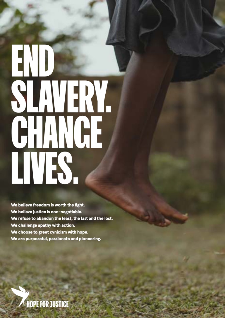
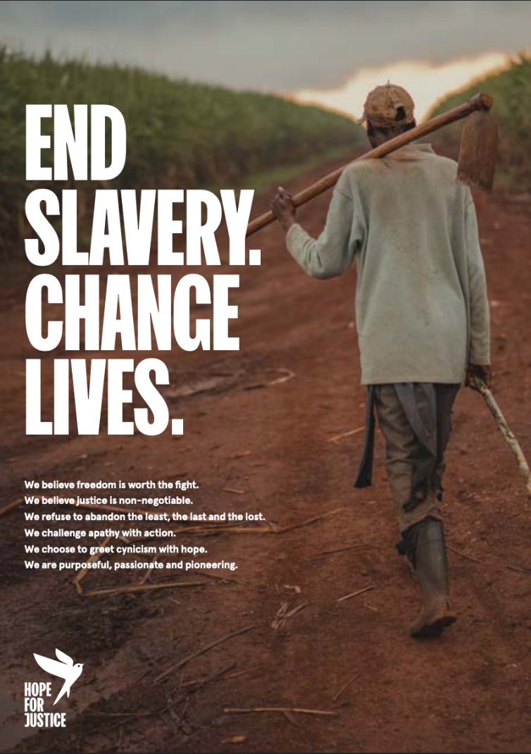
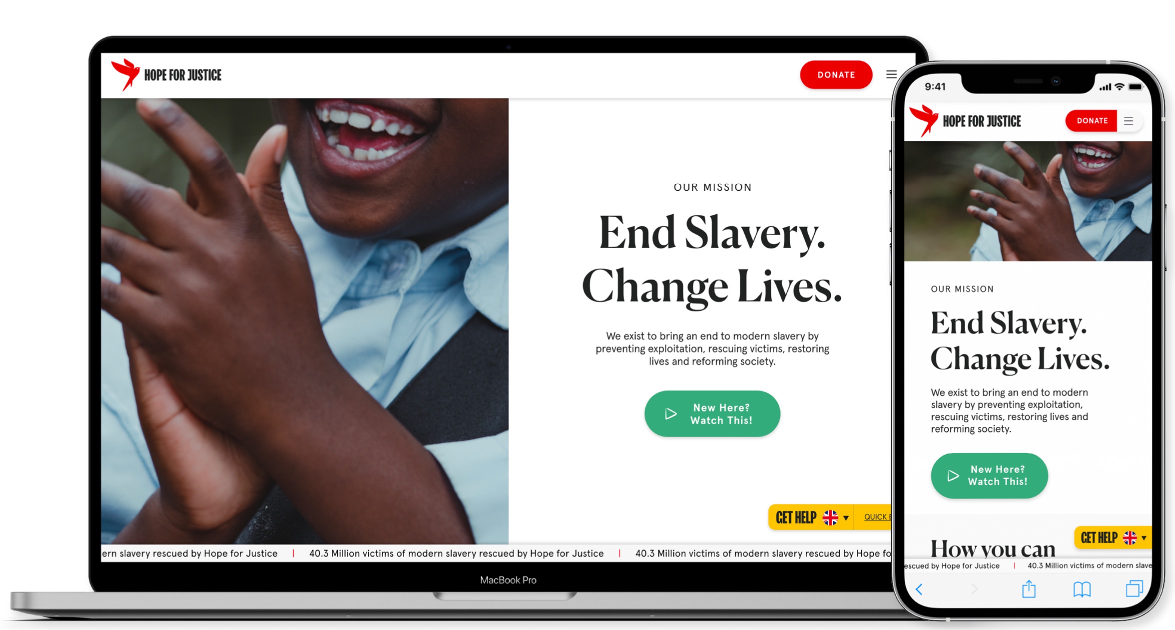
We exist to bring an end to modern slavery
by preventing exploitation, rescuing victims, restoring lives and reforming society.
End slavery. change lives.
We’re out to change
the world
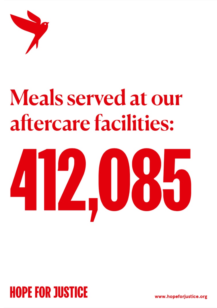
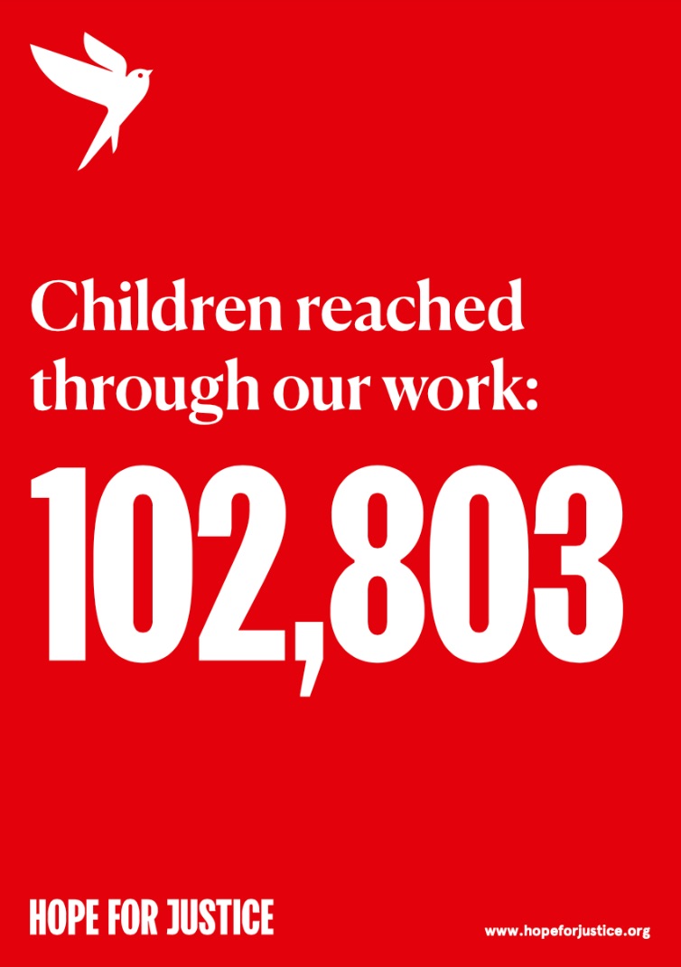
Children reached
through our work:
102,803
03Logos
Our symbol is the embodiment of our mission to change lives. The
sustaining hope and optimism that we can and will live in a better world
You must not use any Hope for Justice logo without
prior written or emailed approval. If you wish to discuss using the Hope for Justice logo on
a webpage, printed material, video or other resource, please email: media@hopeforjustice.org
3.1Logo
- systems
Our 5 logos offer a range of possibilities for representing the brand
across different communication platforms.
The logo marque is the core logo of the Hope for Justice brand. Embodying the mission to change
lives and end slavery.
The logotype can be used stand alone or to supplement the logo marque when the Hope for Justice
brand needs reinforcing, this diversity allows the marque and logotype to be expressed in
different ways to multiple target audiences.
The logoform connects the Hope for Justice name to the marque and communicates both parts of the
brand in the most direct way.
Logo marque

Logo type

3.2Logo
- exclusion zone
An exclusion zone has been designed to create a clear space around the
logo. To ensure clarity, it is important that other elements do not enter the exclusion zone.
The exclusion zone is based upon the height of the logotype. To maintain a strong brand image it
is important that the logos are always applied consistently and never manipulated or distorted.
04Photography
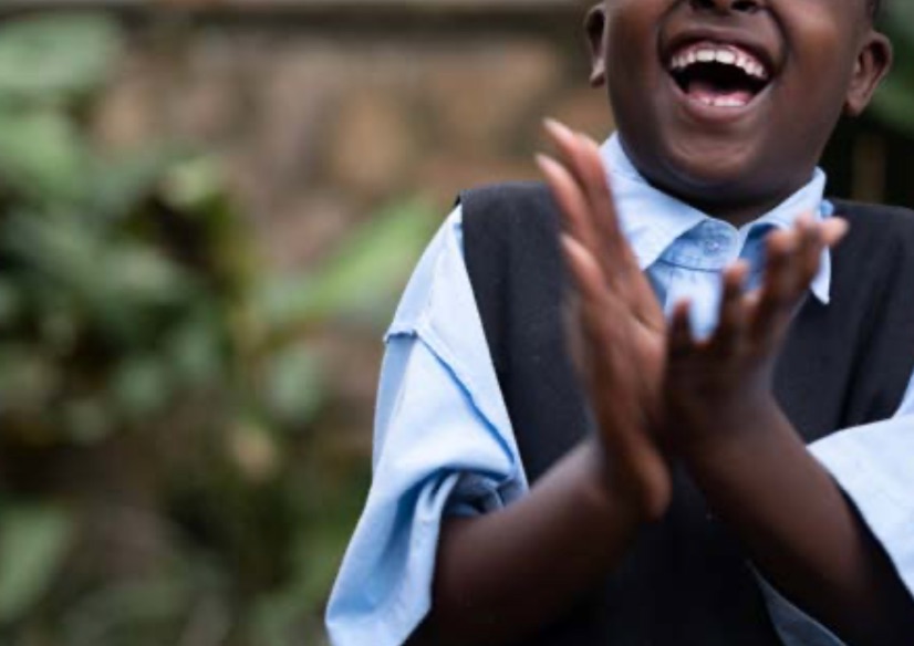
Goal: To convey a sense of hope and the transformative actions of Hope
for Justice.
Casting: People are relatable and diverse
Interactions: Express support
Compositions: Ensure negative space and convey a sense of optimism
Lighting and colour: Natural with increased contrast
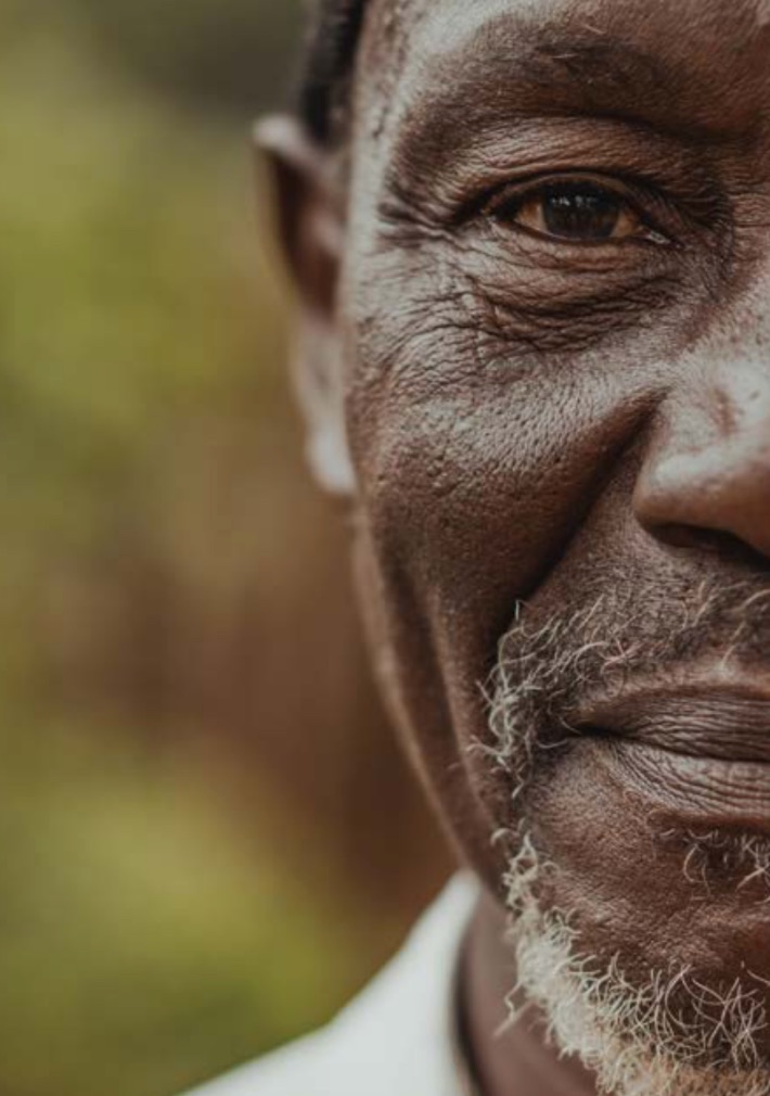
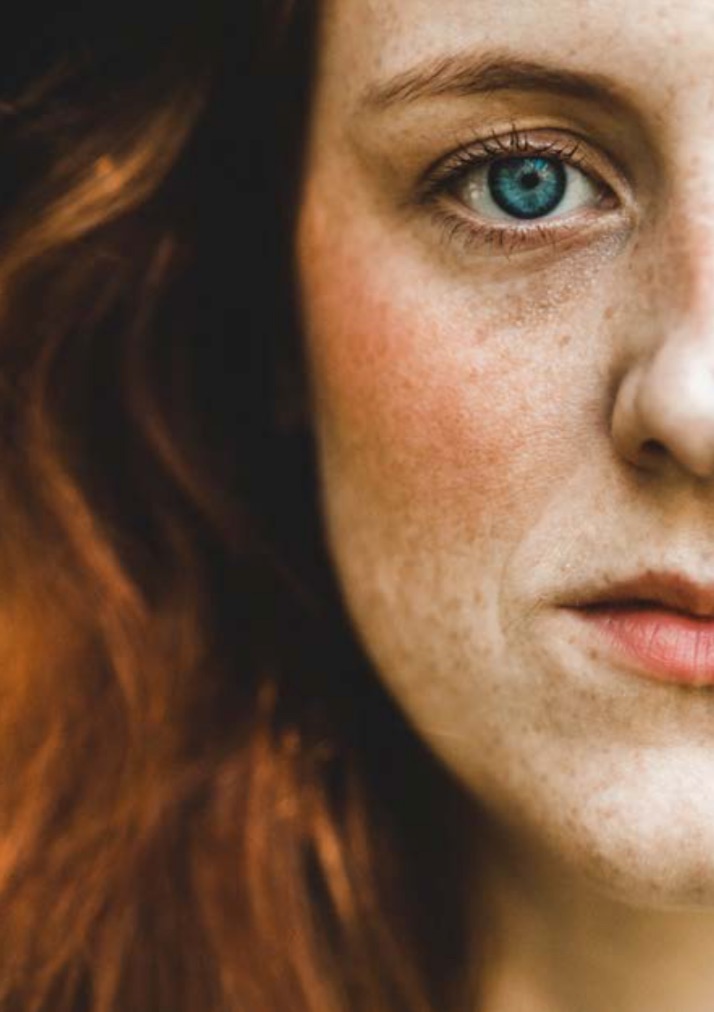
Portraits: Simple, powerful and direct
Portrait style images can be used to connect with the audience and are intended to grab their
attention where time is critical (e.g. fund raising/advertising campaigns, website home page).
The photography must convey a strong sense of purpose, empowering the audience.
4.1Client protection
In circumstances where the identity of our clients must be withheld focus
on details of the individual to convey their story, for example their hands or the back of the
head with the subject in thought or engaged in an everyday acitivity.
There should be no elements within the photographs that make the subject identifiable (e.g.
eyes, tattoos, specific jewellery, written names).
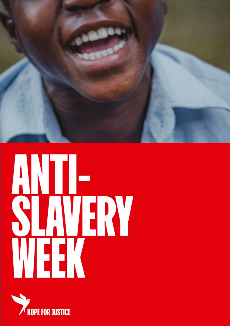
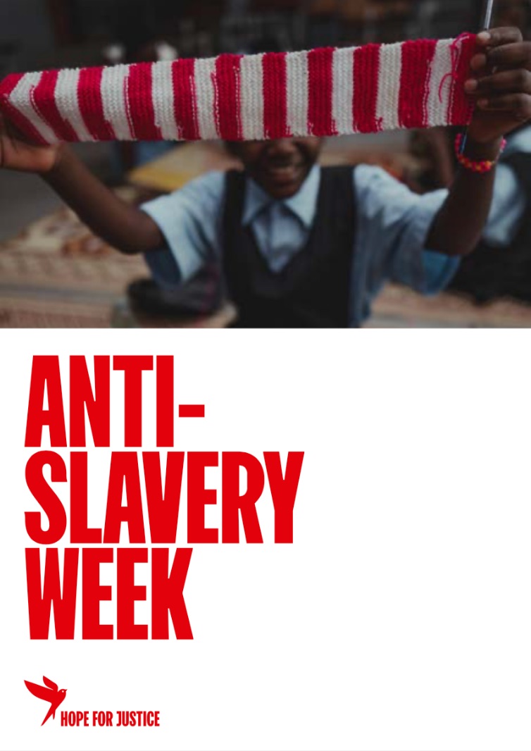
05Application examples
The composition system has been designed to be simple and flexible across
all applications. The minimal style of the composition allows for maximum impact of messaging
and imagery without any distractions. The use of these grid systems will help to achieve a
consistent look across all marketing material.
Hope for Justice is a 501(c)(3) not for profit
organization in the USA, a registered charity in England & Wales (no. 1126097) and in Scotland
(no. SC045769), and a company limited by guarantee, registered in England and Wales, number
6563365. In Norway, Hope for Justice AS is registered under Organisasjonsnummer 915 520 995.